Let’s respectfully redesign government
By Molly McLeod
Designers regularly tear down and redesign materials they dislike. Ugly websites, confusing interfaces, dropshadow-laden public signs—nothing is safe from a determined designer with a few minutes of spare time on her hands.
Slick, colorful screenshots are posted on blogs and visual inspiration sites with little consideration of the goals and restrictions behind the original design. “Look at this terrible typography! I made it so much shinier! Please favorite this image so I can see how popular I am.” I am certainly guilty of this myself.
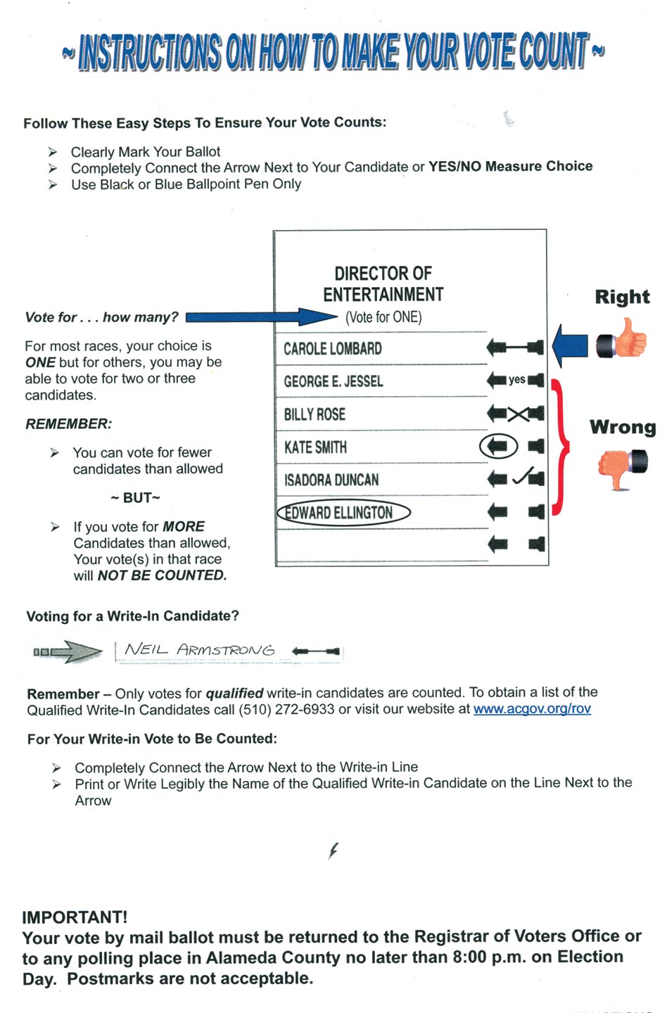
When I received an absentee ballot in the mail this May—my first as a California voter—I was both excited and troubled. While inspecting the small instruction pamphlet that accompanied my ballot, I frowned at the Word Art and counted all the different styles of arrows. Most importantly, I nearly missed a footnote that said my ballot needed to be mailed by May 29th—several days before the election—in order to be counted in time; an Election Day postmark was not good enough.
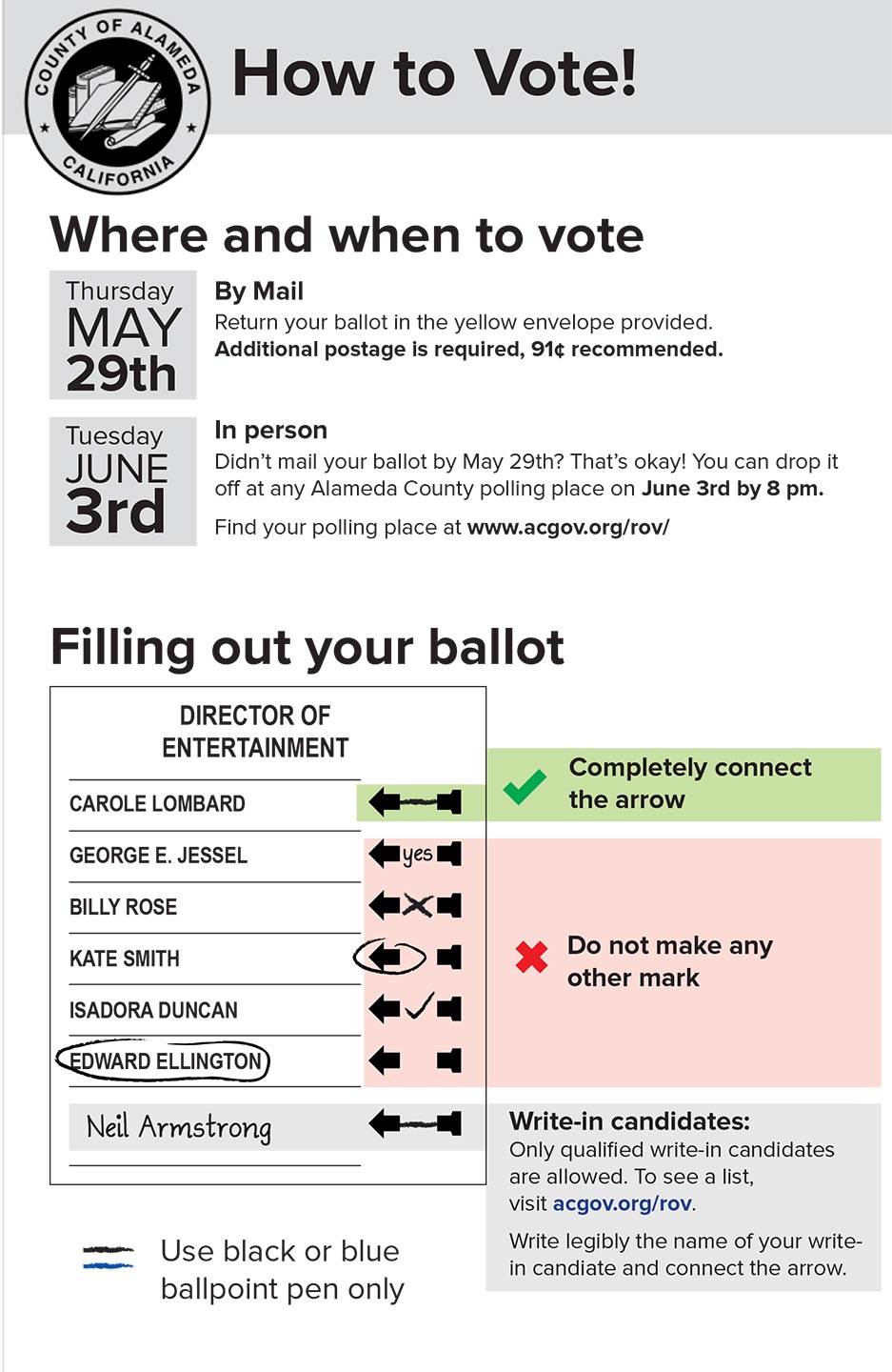
I spent about 20 minutes on the following Tuesday afternoon thinking about the voting pamphlet and I decided to attempt a redesign. I moved the information I wanted to see first to the top—how to submit the ballot and what the deadlines were—and tried to clarify the do’s and don’ts for filling it out.
I tweeted a before-and-after picture, and by the time I dropped off my ballot in Oakland an hour later, it already had more than 50 retweets.
A few days later, my colleague Drew Wilson posted my image to Reddit where it quickly racked up more than 140,000 views and sparked a discussion about ballot design. Many commenters questioned the original ballot’s design. They wondered whether the complicated instructions about connecting the arrows to select a candidate could be replaced by a simpler interaction, like filling in a circle. They had a good point: If a ballot is well-designed, detailed instructions explaining how to use it should not be necessary.
Ballot design is statutorily regulated and has many constraints, and navigating the bureaucracy around voting processes takes time. No one asked usability designer Dana Chisnell to think about ballot design, but she saw an urgent need for it after the contentious 2000 Florida election. Researching ballot design and voter guides became her passion project for years until she turned to Kickstarter to raise funds to turn her research into short, actionable field guides. Her work has helped election officials and poll workers all over the country, including redesigning the 2012 ballots in Ohio.
But unsolicited redesigns can be problematic and may not always be the best method for creating change, especially when they are shared with an adversarial tone. It is easy to complain about something or critique a design without considering the constraints behind it, but complaining without respectful constructive criticism is not going to change anything. However, a redesign can be a powerful way to explore alternative possibilities and start a discussion about how it could be improved. When shared tactfully and thoughtfully, redesigns can be a starting point for collaboration.
I know whoever made the original pamphlet that came with my ballot had good intentions. Creating a simple design is not as easy as it looks, especially with the constraints of time, limited design tools and bureaucracy. Whoever made the pamphlet really cared about helping me make my vote count. Three easy steps, they wrote! The thumbs-up clipart, while it may be a little silly and distracting, is a fine attempt at conveying do’s and don’ts in a visual way.
I redesigned this pamphlet for fun. (I guess you know you are a civic design geek when redesigning a voter pamphlet is your idea of fun.) But I know sharing it on social media alone will not make a difference—I have also thought about how I might make my redesign a reality. My first step might be to translate the layout from Adobe InDesign to Microsoft Word so that it can be easily edited by a government staffer.
Government folks: are you working on a pamphlet or form you think could be better? You might find a strong ally in a designer who wants to help. Designers: are there signs, posters, icons, websites or pamphlets you encounter in your daily life that you have a hard time understanding? Try redesigning them. You never know where it may lead.
 Molly McLeod is a designer and Code for America fellow working on health projects. She would love to teach you how to juggle. molly@codeforamerica.org / @mollyampersand
Like this kinda stuff?
Consider donating to help us to continue doing this work! We also encourage reader comments via letters to the editor.